41 Pictures of Design Fails That Ought To Be Changed Prior To Printing or Displaying
It is truly challenging to design a product, ad, or structure. Although humans are naturally creative and appreciative of aesthetics, the reality is that there are tons of design fails that were finalised and displayed for all people to see.
Once you see these images, you'll probably be thinking about them because of how hilarious or disturbing they are. The worst of all designs might even haunt you for months.
It seems that the design team did not even bother re-examining, reviewing or revising them. They just went ahead and displayed it without thinking about the consequences.
Among the best places to look for such fails are in the subreddit r/CrappyDesign/. People are continuously snapping photos of these designs and share them on this board.
People are hanging out there are having the time of their lives by shaming or poking fun at them for the entertainment of the entire internet. From incorrectly placed images to impractical building designs you'll find yourself either facepalming or laughing hard.
The crappy designs make you wonder what people behind them were thinking. It's like they only exist so for the sole purpose of giving us a good laugh.
The one's we've highlighted here were featured on the subreddit recently. Let's check all these design fails out!
1. Not sure if that is well placed.
 u/labanapoy/Reddit
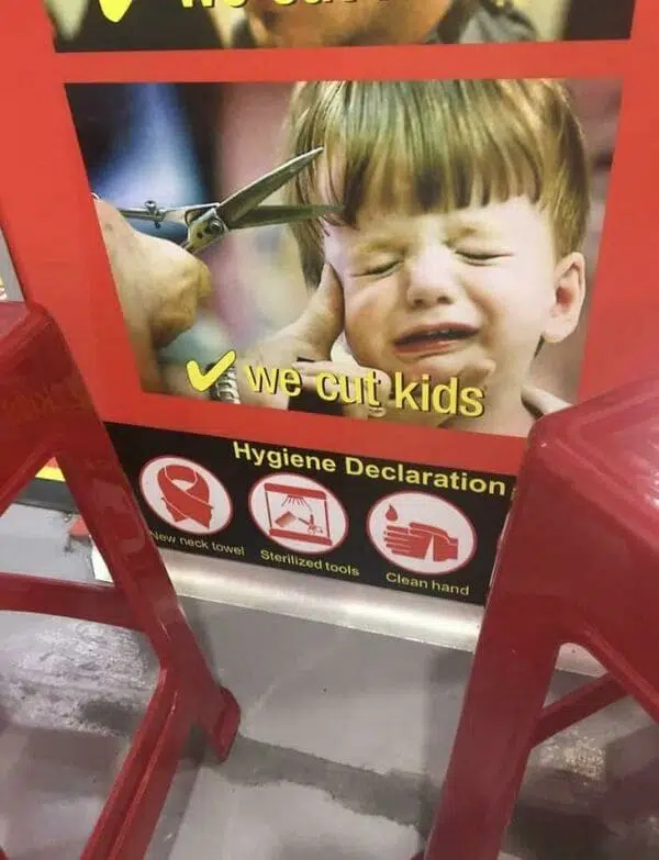
2. This is the best way to scare the kids away during their haircut.
 u/g_nome7/Reddit
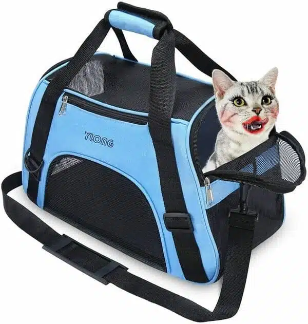
3. For sexy cats only.
 u/moos_in_space/Reddit
4. There's just no way to reach the door's wheel chair access button.
 u/crimxie/Reddit
5. This pet clipper has a unique function. You can pull out a dog from another canine's backside.
 u/ssorrenidrag/Reddit
6. This $18 million sculpture was supposed to read Jax for Jacksonville, but it looks something else.
 u/baltinerdist/Reddit
7. No way to sit in this bench park on a hot, sunny day.
 u/RocketSmash9000/Reddit
8. It welcomes the shorpers.
 u/directtides72/Reddit
9. When the marbling design looks disgusting.
 u/thisshortenough/Reddit
10. Vitamin D, or?
 u/archfapper/Reddit
11. Okay, we get it!
 u/1pcbetterthanxbox/Reddit
12. No drainage on a downhill slope.
 u/M_Alex/Reddit
13. You cannot take full advantage of this pocket.
 u/evening_shop/Reddit
14. This shirt for sale looks like it was splashed with coffee.
 u/TheMrMeatball/Reddit
15. That's not where the earphones should go.
 u/Grognak42/Reddit
In case you want more of these hilarious design fails, just check out r/CrappyDesign/ on Reddit.
People constantly update the board with the latest design fails they find and share it for all internet users to see, shame, and laugh at. These casual onlookers can't believe that the people behind the design didn't even realise the major mistake they committed.
The subreddit already has 2.7 million users as of writing. It has been showing design fails for the past decade.
You can never believe how such designs passed the finalisation stage. But at least, the internet has an extra source of entertainment.
16. Meeko is either a hat or sucking on Pocahontas' head. It's disturbing either way.
 u/embarrased_to_Ask_42/Reddit
17. Looks risky.
 u/Ez31895/Reddit
18. Good intentions, wrong execution.
 u/alphaMrWave/Reddit
19. Badly Photoshopped suitcase cover.
 u/suscript25/Reddit
20. No way to see yourself in the mirror with a panel blocking the view.
 u/freckledfrida/Reddit
21. There is only one way to enjoy the balcony in this Swiss hotel: through the window.
 u/loulan/Redditu/Dtomnom/Reddit
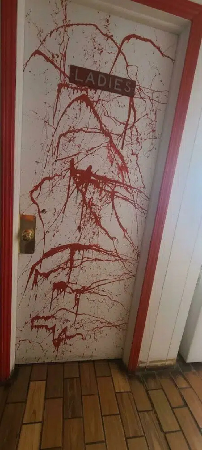
22. The door that leads to doom.
 u/aspiecat7/Reddit
23. This improperly placed picture of a baby looks scary.
 u/ninimalini/Reddit
24. This 'Face Your Fear' temporary Frozen 2 tattoo only says 'Fear' because the first two words have a light orange colour.
 u/Vencero_JG/Reddit
25. How is it possible for an overpass to flood?
 u/jndlcrz888/Reddit
26. You can only use these stairs when you're sober.
 u/OilCareful8232/Reddit
27. These kids aren't excited about the toys.
 u/MeteorBladeV2/Reddit
28. You okay, girl?
 u/lololy87/Reddit
29. That badly placed door handle ruins the picture of the girl.
 u/loselmuh/Reddit
30. Your mailman would get pissed.
 u/popstarter/Reddit
31. The Eiffel Tower got lost.
 u/AmberedVal/Reddit
32. Such a practical bathroom.
 u/schen4181/Reddit
33. Don't never? Okay...
 u/TML_31/Reddit
34. We don't want Hep C, though.
 u/Dtomnom/Reddit
35. Looks like a giant's treadmill.
 u/phillypharm/Reddit
36. But they don't.
 u/terbiun/Reddit
37. Makes you think it's not English.
 u/TitanicsAnInsideJob/Reddit
38. Looks like it magically pees on its face.
 u/-Error-UserNotFound/Reddit
39. You need your phone to view the mall hours.
 u/J-P-4711/Reddit
40. This renovation for a tower standing for 500 years already.
 u/scepticeye/Reddit
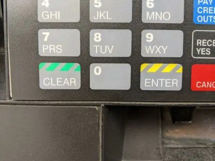
41. With this kind of colour labelling, you'll mistakenly erase your pin.
 u/veeveemarie/Reddit


